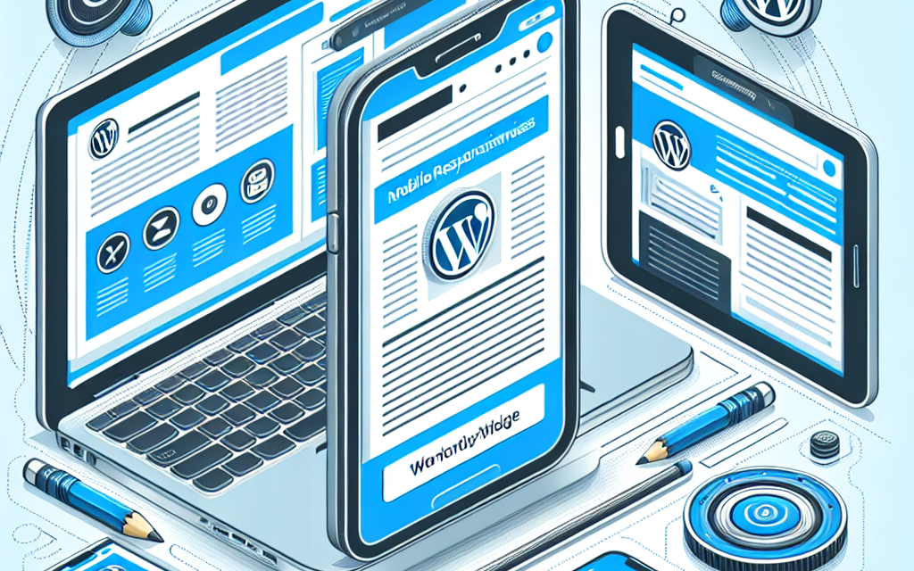
In today’s digital landscape, mobile responsiveness is no longer an option—it’s a necessity. With over half of global web traffic coming from mobile devices, ensuring that your WordPress site looks and performs well on smartphones and tablets is essential for user experience and SEO. At WafaTech, we understand the importance of creating an engaging mobile experience for your visitors. In this article, we’ll explore essential tips that can help you enhance mobile responsiveness on your WordPress site.
1. Choose a Responsive Theme
The foundation of a mobile-responsive website is a responsive theme. A responsive theme automatically adjusts the layout and content to fit various screen sizes. When selecting a theme, look for those with built-in mobile responsiveness. You can find a wide range of responsive themes in the WordPress Theme Directory.
2. Optimize Images for Mobile
Large images can slow down your site’s loading time, especially on mobile devices. Use image optimization plugins like Smush or ShortPixel Image Optimizer to compress images without sacrificing quality. This will ensure that your images load quickly on all devices.
3. Utilize a Mobile-Friendly Menu
Navigation is key to a good mobile experience. A cluttered or complex menu can frustrate users. Consider implementing a mobile-friendly menu (hamburger menu) that keeps your navigation simple and accessible.
4. Test Your Site’s Responsiveness
Before launching your site or making significant updates, it’s crucial to test its mobile responsiveness. Tools like Google’s Mobile-Friendly Test can help you evaluate your site’s mobile performance. Regular testing ensures that any updates you implement do not negatively impact mobile usability.
5. Implement Accelerated Mobile Pages (AMP)
Accelerated Mobile Pages (AMP) is a Google-backed project aimed at making web pages load faster on mobile devices. By implementing AMP on your WordPress site, you can provide a better user experience and potentially improve your search engine rankings. Use the AMP for WordPress plugin to get started.
6. Optimize Loading Speed
Page speed plays a crucial role in both user experience and SEO. Slow-loading pages can lead to higher bounce rates, especially on mobile. Utilize caching plugins like WP Super Cache or W3 Total Cache to improve loading time. Additionally, ensure that your hosting plan supports fast speeds.
7. Use Readable Fonts and Sizes
On smaller screens, readability is essential. Choose fonts that are easy to read and ensure that text sizes are appropriate for mobile devices. A common practice is to use at least 16px font size for body text. Moreover, maintain proper line height and spacing to enhance readability.
8. Limit the Use of Pop-Ups
While pop-ups can be useful for capturing leads, they can also hinder the user experience on mobile devices. Overly intrusive pop-ups can frustrate users and lead to higher bounce rates. If you do use pop-ups, ensure they are easily dismissible.
9. Leverage Browser Caching
Browser caching can significantly improve the loading speed of your mobile site. By allowing browsers to store certain elements of your site, returning visitors can load your pages faster. Most caching plugins allow you to configure browser caching easily.
10. Regularly Update WordPress and Plugins
Keeping your WordPress core, themes, and plugins updated ensures that you benefit from the latest features and security patches. Regular updates can improve performance and increase the overall stability of your mobile site.
Conclusion
Enhancing mobile responsiveness on your WordPress site is crucial for providing a seamless user experience and improving search engine rankings. By implementing these essential tips, you will not only make your website more user-friendly but also ranked higher in search results, attracting more visitors.
If you’re looking to take your WordPress site to the next level, explore WafaTech NextGen WordPress Hosting. WafaTech offers optimized hosting services designed specifically for WordPress users, ensuring speed and reliability. Learn more about WafaTech NextGen WordPress Hosting today and create a mobile-responsive site that stands out in today’s competitive digital landscape!
For more resources and tools, visit the official WordPress documentation and stay updated with the latest trends and best practices.
Your users are mobile—make sure your site is too!

